
ESMA
- Dec 5, 2017
- 1 min read


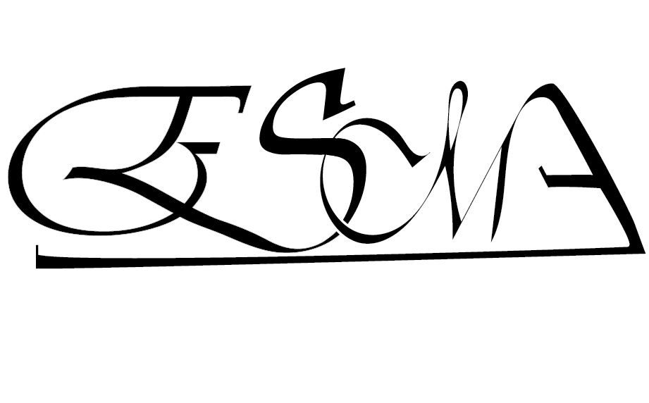

Ligature Logo Project:
Date: November 22, 2017
What is a ligature logo?
Ligature means to tie. Letters that are tied make a compact signature perfect for companies that are known mainly by their initials.
How would describe the corporate identity of ESMA in 5 words?
Bright
Bold
Unity
Eye catching
Modern
Which logo out of the two do you feel is the strongest and why?
I feel my bolder one with sharp edges is better because all the letters fell into place easier than the other and it looks cleaner than the other one.
If you had no requirements or restrictions how would your logo look different?
Yes because I would’ve chose my color’s different because I had to create a sense of unity with the color scheme and the font.
Explain which ligature techniques you have demonstrated on each logo:
Script- I used shared stroke with the A and the M connected them by cutting off a piece of the A. I also used the smooth tool to make everything look easy flowing. I used the direct selection tool to extend the A through the bottom of the logo. I used interlock for the M and the S for an interlock look.
Bold- I used shared stroke by cutting off a piece of the M and connected it to the S. I created my own S to be boxed so it fit well with my font choice. I also made a slant at the bottom with my A so it can connected with my M.


Comments